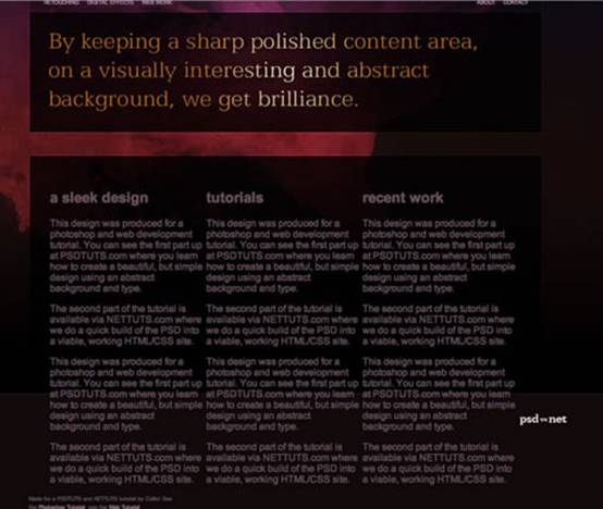
第十步
现在该增加内容了!我们先写些伪文本来形成列。下面是HTML:
<div id="outside_container">
<div id="container">
<a href="#"><img src="images/logo.jpg" id="logo" /></a>
<ul id="menu">
<li><a href="#">Retouching</a></li>
<li><a href="#">Digital Effects</a></li>
<li><a href="#">Web Work</a></li>
</ul>
<ul id="right_menu">
<li><a href="#">About</a></li>
<li><a href="#">Contact</a></li>
</ul>
<img src="images/panel_home.jpg" id="panel" />
<div id="content">
<div class="column1">
<h2>a sleek design</h2>
<p>Dummy Text: This design was produced for a photoshop and web development tutorial. You can see the first part up at PSDTUTS.com where you learn how to create a beautiful, but simple design using an abstract background and type.</p>
<p>The second part of the tutorial is available via NETTUTS.com where we do a quick build of the PSD into a viable, working HTML/CSS site.</p>
<p>This design was produced for a photoshop and web development tutorial. You can see the first part up at PSDTUTS.com where you learn how to create a beautiful, but simple design using an abstract background and type.</p>
<p>The second part of the tutorial is available via NETTUTS.com where we do a quick build of the PSD into a viable, working HTML/CSS site.</p>
</div>
<div class="column2">
<h2>tutorials</h2>
<p>Dummy Text: This design was produced for a photoshop and web development tutorial. You can see the first part up at PSDTUTS.com where you learn how to create a beautiful, but simple design using an abstract background and type.</p>
<p>The second part of the tutorial is available via NETTUTS.com where we do a quick build of the PSD into a viable, working HTML/CSS site.</p>
<p>This design was produced for a photoshop and web development tutorial. You can see the first part up at PSDTUTS.com where you learn how to create a beautiful, but simple design using an abstract background and type.</p>
<p>The second part of the tutorial is available via NETTUTS.com where we do a quick build of the PSD into a viable, working HTML/CSS site.</p>
</div>
<div class="column3">
<h2>recent work</h2>
<p>Dummy Text: This design was produced for a photoshop and web development tutorial. You can see the first part up at PSDTUTS.com where you learn how to create a beautiful, but simple design using an abstract background and type.</p>
<p>The second part of the tutorial is available via NETTUTS.com where we do a quick build of the PSD into a viable, working HTML/CSS site.</p>
<p>This design was produced for a photoshop and web development tutorial. You can see the first part up at PSDTUTS.com where you learn how to create a beautiful, but simple design using an abstract background and type.</p>
<p>The second part of the tutorial is available via NETTUTS.com where we do a quick build of the PSD into a viable, working HTML/CSS site.</p>
</div>
</div>
</div>
</div>
在这段代码中,你可以看到我在内容区域加了3个新的<div>,每一个<div>包含一个<h2>标题元素和一些文本。他们的class名称是column1、column2、column3(列1、列2、列3)。加上文本是为了展示怎样形成列。
为了让他们看上去像列的样子我们先来添加一段CSS:
/*
Content
*/
#content {
padding-top:435px;
padding-left:85px;
width:815px;
color:#674f5d;
font-size:13px;
line-height:20px;
}
.column1 { float:left; width:230px; margin-right:30px; }
.column2 { float:left; width:230px; margin-right:30px; }
.column3 { float:left; width:270px; }
我用一句注释为新的CSS段落起头,然后为#content设置样式。注意padding-top值....435px!设这么大是为了给之前绝对定位的元素空出地方。与绝对定位的元素不同,content是从属于页面正常流的。
这是因为你还要在content中加入更多内容,把footer推到下面去。绝对定位会让它覆盖在footer上方。
然后我给三个column分别设置宽度并加上float:left,这可以让它们漂向页面左边,与其他向左浮动的元素对齐。为了不让他们紧挨在一起,我给前两个column赋予了右外边距。
浮动一个元素会让它漂到左侧或右侧,并使其它元素环绕在其四周。加入另一个浮动元素,二者会并排成列。基本上你看到的列布局都运用了float(浮动)。
不幸的是,浮动元素会出现一个怪问题——它们跟自己的容器不对付,并且会漂到下一个元素上方而不是把它往下推。解决这个问题的方法就是给浮动元素后面的某个元素加上属性clear:both。
Clear(清理)属性可以阻止元素环绕浮动的<div>,这有点儿不好解释,我们直接看看清理和不清理分别会出现什么状况吧。 [NextPage]
不清理
布局看上去会像这样:

几个列漂在footer上方,footer环绕着列。这可不对!
清理
方法相当简单,我们只需要在三个列后面加上一个<div>,如下:
<div id="content">
<div class="column1">
<h2>a sleek design</h2>
<p>This design was produced for a photoshop and web development tutorial. You can see the first part up at PSDTUTS.com where you learn how to create a beautiful, but simple design using an abstract background and type.</p>
<p>The second part of the tutorial is available via NETTUTS.com where we do a quick build of the PSD into a viable, working HTML/CSS site.</p>
</div>
<div class="column2">
<h2>tutorials</h2>
<p>This design was produced for a photoshop and web development tutorial. You can see the first part up at PSDTUTS.com where you learn how to create a beautiful, but simple design using an abstract background and type.</p>
<p>The second part of the tutorial is available via NETTUTS.com where we do a quick build of the PSD into a viable, working HTML/CSS site.</p>
</div>
<div class="column3">
<h2>recent work</h2>
<p>This design was produced for a photoshop and web development tutorial. You can see the first part up at PSDTUTS.com where you learn how to create a beautiful, but simple design using an abstract background and type.</p>
<p>The second part of the tutorial is available via NETTUTS.com where we do a quick build of the PSD into a viable, working HTML/CSS site.</p>
</div>
<div style="clear:both"></div>
</div>
看到底部的<div style="clear:both"></div>了吗?只用一个声明清理那三个列的空<div>,就解决了我们的问题

